top of page
SAMMAMISH
ANIMAL SANCTUARY
OBJECTIVE
OVERVIEW
I was given the task of rebranding Sammamish Animal Sanctuary (SAS) and creating a brandbook that could be handed off to future designers. The primary focus for the brandbook was a logo redesign, a revamp of their visual identity and improving their mobile UI. SAS is a non-profit that takes in unwanted farm animal and that needed to be immediately apparent in the rebrand.
SCOPE: Rebranding
ROLE: Graphic and UX Designer
TOOLS: Adobe Illustrator, Figma
TIMELINE: 5 weeks (30 hours)
RESEARCH
Before starting the design process, I had to first conduct secondary research to better understand SAS’s mission and audience. This involved doing a deep dive on their current website and looking for any noteworthy information as well as looking for any noticeable flaws in their current designs.
LOGO REDESIGN
The next step in the process was working to improve SAS’s current logo. I wanted to give SAS a new symbol they could proudly wear, and that works to encapsulate what matters to them most. Three initial logo drafts were created in order to craft a design that could be used to market the sanctuary, while also conveying their story in the process.
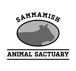
OLD DESIGN
Their old logo did a decent job of showing off who they were, but was not recognizable and did not really work well as a logo.
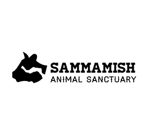
FIRST DRAFT
The first draft looked to replicate designs commonly found for milk brands and dairy farms.
SECOND DRAFT
The second design focused on the location of the sanctuary and implementing Lake Sammamish into the logo.
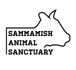
THIRD DRAFT
For the third design I wanted to convey the fact that Sammamish Animal Sanctuary was a big part of their animal's life.
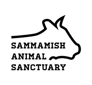
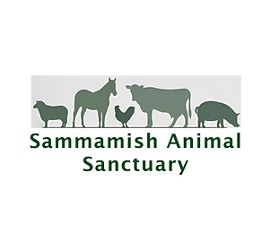
FINAL DESIGN
The final design ended up iterating upon the third design and features the cow’s head framing the sanctuary’s name.
VISUAL ELEMENTS
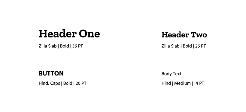
The first step of revamping the visual elements was finding fonts with a combination of readability and rustic charm. After a long search "Zilla Slab" and "Hind" ended up being the final choice.
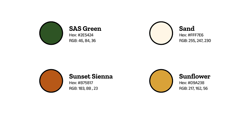
For the colors portion I needed to create a visual hierarchy that was inspired by nature and embodied the sanctuary's ambiance. This led me to choosing a color palate full of greens, yellows and oranges that pushed the vibe I was looking for.
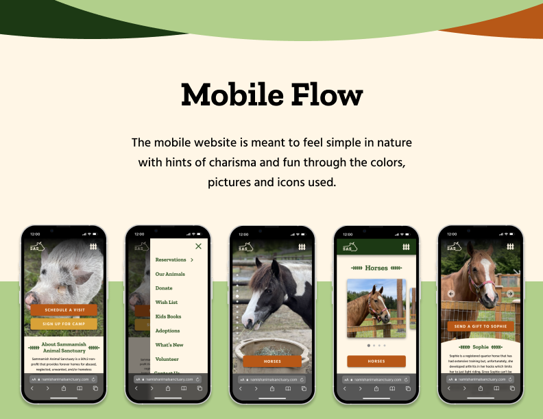
MOBILE FLOW
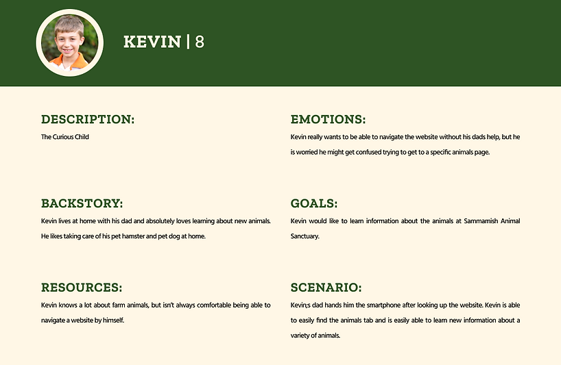
Before working on the mobile interface I needed to identify specific task flows to focus on. In order to do this I created 3 personas, each with a different task they were trying to complete. After some deliberation, I ended up going with Kevin a child trying to view information about a specific animal.
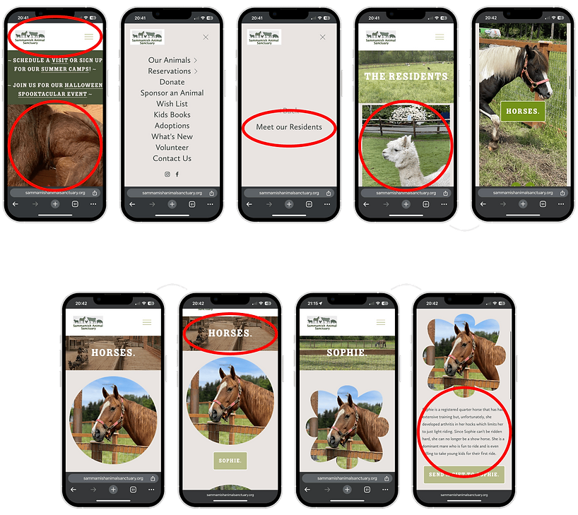
The task flow to look at an animal had a couple of redundant menus as well as elements that were either misaligned or pixelated.
Pictures used and header are too large for mobile
Redundant menu options
Weirdly large images for mobile UI
.png)
Scroll
Scroll
Scroll
Weirdly large title boxes
Information isn’t immediate and requires scrolling
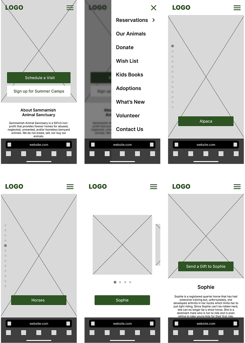
This led to the creation of a low-fidelity prototype that worked to streamline the navigation process and eliminate the issues seen in the old mobile UI.
.png)
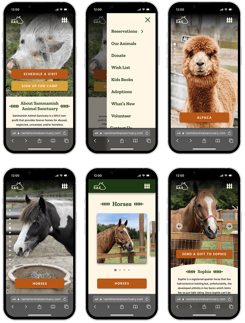
I then worked on upgrading the visual aspects of the prototype and adding the visual design elements that were chosen previously to create a new mobile site that better fit SAS as a brand.
.png)
BRANDBOOK
The last thing I had to work on was a brandbook that would be a culmination of all the design elements laid out so far. This was its own unique design challenge, and had me working to create visually appealing guidelines that future designers would be able to follow.

1/10
REFLECTION
This project really forced me to flex my design skills in a way I have never done before. I was not super familiar with branding or logo design beforehand, and I had to put in a lot of hours to get my knowledge up to where it is now. The SAS rebrand also happened to be my first big project in my career and taught me a lot about the how to iterate upon previous designs and continually move forward in the process. I am really grateful that I got the chance to work on this rebrand and hope to do more in the future.
bottom of page